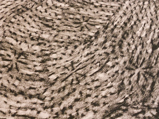
For this self portrait I used a graphite pencil. You can't really tell with the picture, but I love the value I created with the eyes and nose. I said in my contour line self portrait I have the hardest time with the jawline and eyes, but in this one I think the eyes came out the best. I was drawing from a picture of me laying down, so my eyes are looking up a bit. I like the texture I created with my hair, although I think it could have been a little messier since i was laying down. I laughed when I looked at my very first self-portrait because I didn't create any sense of value and the proportions were not as accurate. For my background, I ran out of space, so I wanted something that was layered and tried doing a latisse type drawing. I guess for two different reasons I wanted that as my background- I love using it in pastry and I think I'm hard to read, hence the layers that people can see and that only I can see. I really like how this final piece came out, I would love to try it with charcoal to add more value. My one compaint on this portrait would be my face came out wider then it should have, but overall think I captured my features and others could see the resemblance as well.
Wednesday, December 7, 2011
Saturday, December 3, 2011
contour line drawing of myself
Since I'm not great at drawing faces, my goal was to draw a face that resembled mine. I took a picture of myself and started drawing with a graphite pencil. The hardest parts for me were the eyes and the jawline, but overall I think I did a decent job. I think the size of all my features is consistent with each other. It doesn't look exactly like me, but if you squint or look quickly, you can tell it's me, which I'm pretty happy with.
Sunday, November 20, 2011
Point of View
(Ant's Eye View)
(Bird's Eye View)
(one point perspective)
(two point perspective)
(three point perspective)
Thursday, November 10, 2011
Color
I used a monochromatic color scheme with the base color violet. I used four different hues to show value. I really liked this assignment because I love making collages and it was very similar to that. My piece is of all different shapes of vases.
Tuesday, November 1, 2011
Monday, October 31, 2011
Still Life Texture
I thought this was both fun and challenging. Picking the right prints/rubs was difficult to match for value. I actually wish I had done more prints. The rubs, especially the conte and charcoal were pretty messy. I didn't try the hair spray trick and probably should have. Overall, I love doing collages, so I hope it came out alright and showed the proper values.
Saturday, October 29, 2011
Texture
Ink Leaf Print
Conte Crayon Mat Rub
Ink Tea Bag Marks
Ink Dipped Rose Print
Lead Pencil Rub on Tile and a Light Switch
Light Switch Rub
Textured Candle Rub
Sunday, October 16, 2011
Sunday, October 9, 2011
Photos of Objects and Final Composition
The shadows were not as dramatic as I would have hoped. It was in daylight plus a lamp next to it, so unfortunately it had more than one light source.
Sunday, October 2, 2011
Still Life Objects/Plane and Volume
Here is my contour line drawing of the still life objects that were painted white. In addition are the two drawings showing plane and volume. For the first I used compressed charcoal and for the second I used soft vine charcoal.
Positive/Negative Spaces
For the positive space, I just followed the rules of the contour line drawing, so I hope I did that correctly. I used a soft compressed charcoal stick for both. The negative space I was kind of unsure about because the readings example made it kind of complex. I took the books example to figure out the negative spaces. I'm not sure if it's entirely correct though.
Gesture Drawings of Myself
One is a sustained gesture drawing that I drew with a graphite pencil, the other is a scribbled line gesture drawing that I did with a ballpoint pen.
Subscribe to:
Comments (Atom)


